
Please note: this site is no longer live. I had nothing to do with the current site. If you want to see a mostly complete version of the site, go here: http://randyjensenonline.com/rlcalt
Developers often hear that building websites is becoming easier with every new website-creation application that’s built. So easy in fact that web designers were suppose to become obsolete with the introduction of Front Page, then Dreamweaver and now apps that tell us to “stop coding and start drawing”. Every one of these applications was another nail in the coffin of the web developer. But as anyone in the industry knows, every day that passes, new technologies are being added to the modern developer’s toolbelt and building a website has only gotten more challenging.
Things like build tools, APIs, new backends, new databases, an infinite number of browsers to test, JavaScript on the server, the demise of jQuery, version controlled code, version controlled designs, designing in the browser, not in Photoshop and assuming scenarios where the user might lose connection on their Windows Phone on the subway going under a tunnel in the middle of submitting their resume so they miss that new job they always wanted are now the challenges that the most developers must take into consideration when building the best web applications and websites on the internet.
This all brings us to today. A brain dump of the last 12 months of development of the new Richland College website.
Table of Contents
- A blank canvas
- Decisions
- CMS
- Technology stack
- Server architecture
- Browser support
- Killing legacy, clean house
- Getting buy in
- Research
- What is working/not working currently
- What do students want?
- What is needed internally?
- What is needed for the marketing department?
- Design
- Flow
- No slideshows
- No hamburger menus
- No sticky nav
- Mobile first
- Development
- Tools
- WordPress
- Responsive images
- WebP images
- Speed
- Responsive menus
- Elasticsearch
- API’s
- AngularJS and Handlebars
- Gulp
- Github
- Offload as much load as possible to jobs
- No plugins unless necessary
- No jQuery
- Social buttons vs actionable buttons
- Testing development
- Responsive testing (mobile devices)
- Speed testing
- Google webmaster tools
- Content
- Gokyo Search
- Conclusion
A blank canvas
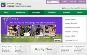
What started as just a “responsive redesign” quickly turned into “let’s start from scratch and update everything”. The new web is so different from where we’ve come that it only made sense to take this time and start over. I firmly believe this is the golden age for scrapping legacy and re-building as much as possible thanks to the massive shift in mobile/responsive design.
This all means that we need to figure out where we currently are and where we want to end up. The requirements of the new project were:
- New, responsive design with a focus on performance
- New CMS (the site was currently flat files)
- Move everything we can to an API
- Rewrite all legacy apps and kill off old servers
- Follow best practices, evaluate current trends and decide which ones make sense
- Use as much open source software as possible and give back as much as possible
- Build a new experience around instant search (based off Gokyo technology)
The requirements were fairly straight forward and since we were building on top of Gokyo (http://gokyoapp.com/) and WordPress, some of the heavy lifting was already done and we could move very quickly.
Decisions
We needed to know what the technology stack was before we started rewriting everything. Because of my background, this was already pretty much set in my head.
 CMS
CMS
WordPress. This is a no brainer for me as I have an extensive background in WordPress development. We also get a huge lift as far as user management, media management, robust theming and plugin architecture and everything else WordPress brings. The other thing that was important to me was that WordPress continually gets better without me having to devote a team -that we didn’t have- to continue working on it.
Technology stack
PHP and MySQL
WordPress is built on PHP and MySQL, so we decided on the main server to use a traditional LAMP stack. We still are looking to move from MySQL to MariaDB but it was one of those things that just didn’t take precedence during development.
NodeJS, MongoDB, Express
Much of the stuff we were doing was AJAX heavy which meant in many cases we were going to have trouble getting good data on how our users were using pieces that we were building. If the  user is typing in to a search box that dynamically returns results, it’s impossible for Google Analytics to give us good data. This meant we needed to build out our own analytics platform to collect these searches. The easiest way I knew how was to deploy a quick Node app with a basic API using Express. Whenever a user typed a search into any of our instant search boxes scattered throughout the site, we would store that search in Mongo. Once we have this data, we can better understand how users are using the search and how we can optimize it and correct any inconsistencies.
We would also use Node for several other smaller things like using SpookyJS to drive CasperJS to create multiple responsive screenshots for easier testing for less knowledgeable users. I won’t dig too deep into this because it gets a bit complex, but just know that NodeJS can be used in any number of amazing ways.
 AngularJS and its demise
The first round of apps that were moved from ColdFusion (yes, ColdFusion) to the new API architecture had the front-ends built out in AngularJS which I really enjoyed using. However, because of the fragile nature of their rapid releases, which seemed to include dot releases with breaking changes, our small development team -of me- just simply didn’t have time to keep up with the rapid pace of change.
We also scaled back several of our apps quite a bit due to time constraints which meant Angular made less sense as a whole. The main application we wanted to build was a robust class schedule app. One where the user could do things like track their progress, search based on anything they want like time or days, view reviews of previous classes, etc. This ended up being a bit too ambitious for the first release but it’s something we’d like to revisit someday.
We ended up moving everything to pure JavaScript and Handlebars which would give us just the templating piece of Angular that we really needed.
I still really like Angular but we simply didn’t need everything it had to offer and its release cycle was just too aggressive for us. In the end, it was us, not them.
 Server Architecture
Our sys admin is pretty amazing so we already had all of the new servers inside VM’s that we could easily spin up whenever we needed a new one. You’d be surprised what a revelation this is inside of academia where most servers are still physical boxes. The servers are now broken up into our main server with the website, an api server and a blog server. We used Ubuntu Server edition on the servers.
Browser Support
In early 2014 we added a message to our site for Internet Explorer 7 & 8 users that the Richland College website would no longer support those browsers as of January 2015. The cost of development time just isn’t worth it to make sure more advanced things work in these buggy browsers. We also don’t have many IE7 users and IE8 was on a steady decline so we thought this was plenty of notice for these users to switch to Chrome or another browser that runs on Windows XP.
Our browser support ended up being all Grade A browsers: Chrome, Firefox, Opera and Safari (is Safari still considered Grade A??) as well as IE9 and up, with an honest attempt to make as much as possible work in IE8.
Your browser support should be determined not by what other people are saying, but what your analytics are telling you. If you still have 10% of your users using IE6…I’ve got bad news for you. However, if you can get your browser support to be IE9 and up, your team is going to have things much easier. If you can make it IE10? You’re home free. With IE10 and the looming transition to whatever browser that Microsoft’s Project Spartan ends up replacing IE, Microsoft has finally fixed many of the rendering bugs and added features that we take for granted in other browsers.
Killing legacy, cleaning house
 A long time ago, in a world apparently very far away, someone decided that using ColdFusion for everything was a great idea. We were stuck with a Windows 95 server running an old version of ColdFusion with Microsoft Access. Rewriting everything currently written in ColdFusion was the first priority. Over 5 years ago, I promised my sys admin that I would help kill that server. I was finally going to have a chance to make good on that promise.
Richland’s staff directory was served from here as well as the Continuing Education Class Schedule and many other small pieces that were built in ColdFusion through the years.
The largest pieces were the Credit Class Schedule, Continuing Education Class Schedule, Emeritus Schedule and the Staff Directory. In order to accomplish our universal search feature, we needed to get all of this data out of Microsoft Access, XML files and SQLite and into Elasticsearch.
 The other big thing that needed to be cleaned up was the plethora of blogs that had accumulated over the last 10 years. There were blogs scattered on three different servers and all in different states of complete disarray. Some of them were partially on a WPMU network. Most of them were stand-alone installs. None of them were updated to an even almost current version of WordPress. Honestly, most of them were just spam comment sites at this point.
I sat down over the Christmas break and moved everything on to a single server, cleaned up all of the databases, and moved them all into a fresh WPMU install. So fresh and so clean.
 My word of advice during your cleanup phase: do everything you can to get things into open source or standards-based programs and languages. Getting things out of Microsoft Access is something no one should ever have to do. I know people in academia think that open source software is full of security vulnerabilities, it’s no better/worse than closed source software. Remember, you’re not going to be using all kinds of random software that you’ve never heard of and found on some shady download site. You’ll be sticking with a set of common technologies that are battle-tested and used by massive organizations all around the world.
Here are some articles about the benefits and power of open source including one that states “98 percent of all enterprise companies are using open-source software in some capacity“.
Getting buy-in
Early in on the process, one of our guys gave a responsive design presentation to administration to gauge their support for a new responsive site. They were already wanting a fresh face on the site, so throwing the responsive stuff in was a no-brainer. They were very supportive and the initial buy-in process was much cleaner than I would have imagined based on past experiences with administration. We had the support we needed, now we could start down the path of actually building what we had envisioned.
If you’re having trouble getting buy-in, here are a few things I’d recommend focusing on:
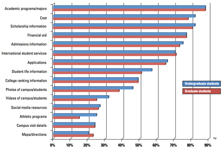
 Maybe the biggest thing I found to be helpful was a Noel-Levitz report. You can see a peek into some of the more interesting data points here without needing to pay for it up front. Administration has a lot of pressure to make sure enrollment is always going up and they often rely on data to make decisions so they can show why they did something. The more data you can bring with you, the better.
Make sure they understand that mobile is not going away. I’ll bet each one of your admins has a smartphone in their pocket. If your site is not responsive, ask each of them to open it up on their phone. Now have them open up a responsive education site (like Richland’s maybe?).
Another interesting tidbit I mentioned was that many students _only_ access the internet from their mobile device. This means that potentially there will be a large group of students that will never be able to use your website properly if it’s not responsive. As of January 2014, “34% of cell internet users go online mostly using their phones“. It’s a matter of time before “mostly” becomes “only”.
Research
 The last redesign of the site was around 2008. Our biggest focus then was cleaning up the navigation and flow of the site, moving all of the sub-sites with custom designs back into the main design and cleaning up the content as much as possible. The site was highly regarded when it launched and we even received emails from students that said they chose our college over closer sister colleges because of the website. That proves how important a well designed website is. Pretty cool. If you need help, please reach out for consulting.
So what did we learn from the last redesign?
The Good
Bringing all of the child sites into a single design was a huge benefit to the students and faculty. When every department and academic division has its own design, users feel like they’re jumping to completely different colleges every time they click. It’s integral that the design maintain consistency as much as possible.
A clearly laid out navigation makes things easier for everyone. The previous site had about 20 items in the navigation and it was difficult to find anything. We pared that nav down to 7 items and removed any type of jarring mega drop down that we see so often now. All different groups of nav were laid out in a much more logical way. Types of students, campuses, main, etc. This allows people to focus on chunks of data until they find the area that fits the type of information they’re looking for, then they can refine their search to the specific link.
The design on our 2008 site was simple and clean, allowing the user to find what they need without any jarring design decisions distracting them. Content was easily scannable, left hand navigation was simple, each page looked similar. There are many other small things we think worked well like keeping content widths narrow, making sure contact information was on the homepage of every sub-site and making our own custom schedule system to ease readability.
The Bad
 All those menu items I mentioned above? We needed to do something with them. Accordions were hot at the time and it seemed like a good solution for us to kind of tuck away some of this information. This was a terrible idea. It hid all this content from anyone except those who knew it was there. When surveyed, students never knew the accordion existed. Ever.
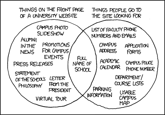
The content below the fold of the site was simply not that interesting. It was laid out in a basic three column layout and included things like the events calendar, “spotlight” programs and then some weird news items in an accordion. The spotlight programs never got updated and the news column was filled with news that no one cared about. The result? Our heatmap software showed us that almost 100% of the clicks on our site were above the fold. People may have scrolled to see the upcoming events and scrolled back up, but no one clicked.
Slideshows will be slideshows. Everyone wants them. No one wants to click on them. Our marketing department leaned heavily on them to appease programs looking to promote events and such. It ended up being a dumping ground for marketing programs so they could be checked off, but the click-throughs were minimal. Again, this data is from heatmap software, so we’re limited somewhat by what we can infer visually. But it was pretty clear. As a personal observation, I don’t believe this is the marketing department’s fault either. We as developers need to come up with better solutions for them. And I think with the new site, we’ve found something that feels right. Never blame someone else for something that we, the developers, can control.
Moving forward
So we know what did and didn’t work from last time. Next we tried to figure out how colleges were innovating. The reality? There isn’t much innovation. There were certainly some standouts. But overall not much has changed since I last redesigned the site almost 7 years ago. Several sites have really nice, responsive designs. But there was no real innovation happening. Each site was just getting skinned with a new responsive template.
We wanted to try to bring something new to the table with our site. Many of the decisions we were going to have to make mostly revolved around how to build out a great responsive website and deliver the same content to everyone. Not an easy task to overcome.
What do students want?
 I think this is pretty simple. Students want access to information as quickly as possible. Is it registration time? Then make sure they can get access to the latest schedules with little effort. Middle of the semester? They’re probably wanting to know how their basketball/baseball/etc teams did. End of the semester? They want to check their grades and do any final checks to make sure their assignments have been turned in. Get them what they want, when they want it. Easier said than done.
The Noel-Levitz report told us that students wanted academic program listings, cost (not quite as much as their parents though :) and types of financial aid/scholarships. That’s a great starting point for most schools. Make sure those pieces of data are easily accessible to your students.
 What is needed internally?
For faculty and staff, the website is thought of more as an intranet than a consumer facing website. We still have to make sure they’re able to get what they want. But guess what? They want access to data quickly and easily just like the students want. They just want different data. This challenge will be the baseline for the entire redesign.
What is needed for the marketing department?
So we’ve talked about the students and the internal staff, but we haven’t touched on the thing that almost every website on the internet is actually being used for. Marketing your service/product/institution.
We know that slideshows aren’t working and we know that boring, static content below the fold is pretty much dead. But marketing needs places to put content and current events and promotions. They need to be able to tie print campaigns back into the web. They have a list of specific programs that needs to take precedence from semester to semester. How can we make the website work better for them? Actually make people want to click through? We’ll be tackling these issues later.
Design
 Flow
Flow
We knew that we wanted the design to be just as great of an experience on mobile as it was on desktop. I started doing some basic mocks in Photoshop but quickly moved out of that and straight into designing in the browser. I still like to get some ideas out of my head at times in Photoshop, but ultimately, the majority of the design work will be done in code. This method suits me pretty well, but your mileage may vary. Do what you feel most comfortable with.
No slideshows
We knew from our last design and from the plethora of data now available that slideshows are not always a good way of presenting things. That being said, we still need an area where we can showcase current marketing initiatives and other things going on at Richland. After quite a few iterations, we decided to essentially take the slideshow concept and just flatten it. Sometimes the simplest solution is the best. Every image would be static with a single large image above and four smaller images below that. This still gives the marketing department five areas (which was our limit on the old site) but every person gets guaranteed visibility to every user. Win win.
I think slideshows often get a bad name because they are almost always poorly implemented and end up getting stuffed with anything that comes up. I’ve seen slideshows with 15 different slides. Who is going to sift through that? If you must use a slideshow, here are some of my thoughts.
Make sure the user can control it. Use dots or arrows on desktop and make sure swiping works on touchscreen devices. Five slides is a good limit to have. Save the fancy transition effects for the magic show. Use a basic animation that lets the user know something is happening, sliding or fading work best. Keep the transition time down to around 300ms. It should be quick but not jarring.
No hamburger menus
 I’m not going to get in any arguments about hamburger menus. I don’t have damning evidence that they are the work of the devil or that they are amazing. I can tell you the decision I made was to not use them in our main navigation of the site because I wanted to keep the experience as cohesive as possible for users on phone, tablets and desktops. I don’t believe that in our industry, education, that any of these users is inherently different. They all want to be able to access the exact data they want as quickly as possible. Whether that be a phone number, registration dates, schedule information, etc. The best way I know how to give that to them is to keep the experience consistent no matter where they are or what devices they’re using.
No sticky nav
When I set out to design the site, I was convinced I was going to use a sticky nav. Everyone was doing it and it seemed to just make sense. However, the more and more I saw them across sites that I frequent, the more I hated them. If I’m scrolling down your site reading content, there’s almost 0% chance that I am actually wanting something in your main navigation or that I want to see your logo.
The other thing that bothered me about sticky nav was that I use the top of my phone’s screen as a marker. I scroll the content to the top then move slowly as I read. If I make a mistake and scrolled too far or want to re-read the previous few words, that damn nav bar pops back into view (if they’re using something like headroom.js) because it’s certain that since I barely scrolled up a bit I must want to see their logo again. I don’t.
 Mobile first
This was obvious. We were very much focused on having an incredible mobile experience. If we could nail the mobile views, the desktop views were going to mostly take care of themselves.
Browsers are not going to keep getting smaller (Smartwatches you say? No. Stop it.) so it makes sense to have a mobile baseline and increase from there.
Development
 Tools
Tools
I wanted to keep the toolset small, but still make sure that we were setting ourselves up to be successful for the next 5-10 years since that will most likely be the lifespan of this site. This meant that we’d be using Gulp for our task runner, GitHub for all our code, Elasticsearch for our custom search engine, Handlebars for our templating and WordPress for our CMS.
WordPress
I have an extensive background in WordPress development. I’m a big fan of the framework and believe in the direction of the company. This will give us a nice boost to get started developing the pieces that we want to be developing instead of starting from nothing and spending too much time on the lower level pieces. It will also give our users a nice experience when we start to allow them to edit their own content.
Of course, that’s not to say that everything is perfect about WordPress. For instance, the editor is mostly a hilarious joke. It really is troubling that the biggest pain point for a CMS is the place where you add content. Wildy installing plugins also gets people in trouble quite often.
Responsive images
 Now that we know we’ll be building on WordPress, we’ll need to figure out a responsive images solution that works seamlessly inside of the WordPress editor. Nothing existed when I first started on this project, so I needed to create something I was happy with. WP Responsive Media was my solution and it allowed users to upload images and insert them in to the editor just like normal, but will add a little bit of markup that will make all the images responsive based on the WP default image sizes. The plugin uses the picturefill polyfill to make sure the images work across as many browsers as possible. There’s still a lot of work that needs to be done with it, but it does exactly what we want it to do for now.
However, I do _not_ recommend you use my plugin. WordPress has since released an official responsive images plugin that I now prefer. I’ve even dumped my plugin I mentioned above for it. The initial release was pretty abysmal but the quick updates have made it acceptable. It’s one of those things that will get better in time.
WebP images
 After hearing about Facebook’s success in creating much smaller image download sizes, I knew that I wanted to serve .webp images for any browser that supported it. That means that for Chrome, Chrome for Android and Opera users, we would need to have special images created on the fly. I created a WordPress plugin called RJ WebP Converter for this very purpose. When an image is uploaded, as WordPress is creating all the custom image sizes, it also creates .webp versions of them. We then check if the users’ browser supports it and serve the appropriate image.
Note: we only do this for any images that are not in the content right now, eg: header images. Once .webp becomes more widely supported, we’ll roll it out to the entire page. We do this in case a user downloads an image in the content. If they get a .webp image, chances are they won’t be able to view it on their computer without opening it in Chrome.
Speed
Speed was always the most important thing. Every decision we made was made only after we questioned what the  implications were for the speed of the site. If we deemed the feature to be important enough, we would find the best way to implement it. This touched everything from the server setup to the images described above to the Gulp tooling we built out. Of course the new HTTP2 spec will change some of the techniques we’re using now like sprites and concatenation. But we’ll modify as it becomes more widely used.
We primarily used WebPageTest.org to see how we were doing speedwise.
Responsive menus
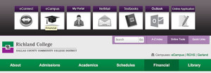
For our responsive menu system, I knew I wanted to keep it very simple. For the main navigation, that meant no hamburger menus, no slide out menus, just a plain responsive menu. On sub pages, there was really no option but to collapse the menu into some kind of drop down. We did use a traditional “hamburger menu” icon, but we have the word “Navigation” in fairly large type to call out the menu.
Elasticsearch
 The biggest swing we were going to take with the new site was our global search feature. This was a feature that I had developed for Gokyo. But I wanted our own implementation of it.
This meant that we needed to decide what data we wanted to be searchable. And then we needed to figure out how we would build that functionality. Elasticsearch offers nice JavaScript API’s and returned JSON Objects that we could easily fit in our current architecture. This would allow us to build out our own search engine with custom data types and handle each one individually.
Currently we can search from our credit schedule, continuing education schedule, emeritus schedule and staff directory.
API’s
We are big believers in the API-first mantra. As long as everything we build has an API, we can easily consume that in our website itself. But if we decide to launch any kind of mobile app or partner with a sister college, we can offer a simple API for them as well. As we progressed through development, there were several times when we needed a new feature which would have been a lot of duplicate development. But because of the API, we just extended it and had the new feature running in no time.
AngularJS
We first built out the Elasticsearch indexer for the new Staff Directory and the new Schedule listings. Once we had that, we could easily search them and consume the data through the Elasticsearch API. We were looking for a templating language to use for the frontend. I decided that we were going to use AngularJS for our entire site wherever we needed templating or other features it offered. We wanted to build out our schedules more like apps than just browsable schedules. The initial build-out went really well and we were even able to support all the way back to IE7 pretty solidly.
The bad news is that because of Angular’s rapid pace of change and the direction of 2.0, I wasn’t comfortable leaving everything we had just done on it. Since I’m in charge of so many different pieces, I didn’t have the bandwidth to also keep up with Angular. I’ve since moved everything to Handlebars and raw JavaScript.
Gulp
I have always used Grunt for my build processes. But I had heard so many good things about Gulp, I figured we’d go with that. Getting up and running took no time at all and it was just as easy to have all the CSS files concatenated and minified as well as our JS files. Everything was neatly tied up and fit perfectly with our focus on performance.
 Github

Version control is a no-brainer these days. Things are so complex that you have to have something in place. Even if it’s some kind of FTP backup solution, whatever works for you, you have to have a proper backup solution in place. I am most comfortable with Git and Github so that was our choice.
Offload as much as possible to jobs
Speed was the number one focus of this entire project. If we were looking at adding anything, the first thing we asked ourselves was, “How will this affect performance?”, If the answer was “adversely”, we had to come up with a very good justification for adding it.
Some of these things were marketing type stuff like bringing in the latest tweets or the most recent blog posts from our WordPress Multisite network. Now I don’t want to make a request to Twitter or our blog server every time the homepage is loaded. So I built out a cron job that runs every 30 minutes that does that for us. Now we can just pull the homepage news items directly out of our database, which is also easily cacheable. Brilliant.
No plugins unless necessary
Since our site was going to be built on WordPress, we have thousands of plugins available to us. However, you remember the speed thing above? Random WordPress plugins and speed don’t go together. I made an executive decision early on that we would not install any plugins that affected the front end of the site unless it was something that we absolutely could not build in house. So far that number is zero. We do have some plugins installed that affect the administrative side of the site.
No jQuery
I like jQuery. It’s how I learned to write JavaScript. But all good things must come to an end. And this is no different. I decided that we would write all our own JavaScript from scratch using only a few limited helper libraries for polyfilling  older browsers and a utility library like Underscore.js. This doesn’t mean that I think anyone else should give up on jQuery, it’s just the route we have chosen.
Social buttons vs actionable buttons
Have you ever clicked the “Tweet This” button on an article? Me neither. Statistics show that a very small number of people ever interact with these buttons.
We made the decision to not have any social media sharing buttons on our pages. Instead we have a small number of actionable buttons that we think people use most. This ended up being a “Print” button and a “Send This to a Friend” button. The print button is exactly what you think. It pops up the print dialog. The “Send to a Friend” is a custom implementation of a modal window that allows you to send any page to an email address right from that page. We may end up adding social media buttons in the future. But I haven’t seen any reason to do it yet.
Testing development
Responsive Testing
Since the site is fully responsive on every page and non-technical people would potentially be editing their own pages, we needed an easy way to test it. We could have used something like Wraith.js. But that really would have been overkill for us. Instead I build out a job based on PhantomJS that would run any page you send it against six common breakpoints. In order to start the job all you had to do was click a button in the WordPress admin and it would run the job and give you a URL to view the screenshots. Simple.
Speed Testing
For all our speed testing, we used webpagetest.org. Anything you could possible want is there. And the best part was the ability to download the tests they ran. When we presented to administration, these assets were huge for us. We also used the PageSpeed Chrome extension to tweak things as best we could. We are always trying to tighten this up. But we think we’re doing a decent job so far.
Google webmaster tools
An oldie but a goodie. Keeping Google happy keeps everyone happy. There’s not much else to say here.
Content
One thing that people forget during a redesign is that rethinking the content is just as important as the aesthetic concerns. If you build the most beautiful website in the world but the user can’t find what they need, you’ve failed. This means that the structure of the site needs to be thought out. But it also means that when they get to the page they wanted, the content itself is structured nicely. As we moved over every single page on the site by hand, we looked at the content to see if it needed to be re-thought. We looked at basic things like: Are the headings breaking up the content nicely? Are the left nav items organized logically? Does the user ever hit a dead end in the content? Are there massive pages that should really be multiple pages?
Content strategy is as important as design.
Gokyo Search
 In life you have one chance to make a first impression. On the web I believe you have one feature to make a first impression. What I mean by this is that users will be forgiving if things don’t work perfectly the first time. As long as the feature they’re trying to use empowers them in some way, they will appreciate the usefulness over any negligible faults. With the new Richland site we decided to try to give our users the superpower to find anything they want in 5 seconds or less (depending on how fast you can type :).
We call this feature: Gokyo Search.
 The idea was initially something I built for my old company Gokyo and I really loved the direction it was heading.The search is built on top of Elasticsearch and indexes basic content like the website, the staff directory, the credit class schedule, the continuing education class schedule and the emeritus class schedule. Just getting these data into Elasticsearch has proven to be quite the challenge. We had data stored in MySQL, SQLite, Microsoft Access, CSV and XML. Yep. Pretty much every piece of data was stored in a different way.
This was just the start of what we wanted to accomplish. We also wanted to build a very basic, natural language search into it as well. We wanted the user to be able to ask it common questions like “where is Building X?” or “when does Spring Semester start?”. This was probably a bit ambitious, but hey, the worst thing that could happen is we could still have a really nice search engine that searches across all of our data structures.
If you want to see this in action, go to the site and search for “where is bonham” (no need for a question mark). You should see a campus map shown in the search results area with Bonham Hall highlighted in purple. Pretty nifty.
We also try to determine if you are searching for a specific class. Let’s say you know for sure you want the WordPress Development Intro class (taught by yours truly). You can type “WordPress” which is what it brings back. Let’s say you’re an advisor and you know more about the class nomenclatures. And you know that the WordPress class is actually “ITSE 2313” or that the registration number is “944281”. You could simply type that in to return exactly that class.
Conclusion
I’m really proud of what was accomplished with the new site and hope people enjoy using it. We had a chance to take advantage of some new technology and give our users a great experience across all platforms.
So there you have it. A mind-numbing journey through our process and how we’ve built the new Richland College site. If you have questions or are looking for help with your implementation, you can look at GokyoApp or get in touch with me directly for consulting.